“It doesn’t matter the size of your home, or the price tag, but what matters is how it makes you feel.” —Selena & Erin, co-owners of Fleurish Interiors
As moms we have a lot of competing priorities: feeding, educating, cleaning, working, fight-stopping, life-saving, loving—the list goes on and on. It’s not a surprise that sometimes home decorating comes as a distant item on that to-do list…if it makes it on the list at all.
But at the same time, home is the place where it all comes together, a place that should feel like a sanctuary that helps us recharge, so that we can conquer all those other tasks on that to-do list…and our families can conquer theirs, too.
This is why Selena and Erin, two moms and interior designers, decided to work together. They share a passion for helping people create beautiful homes that they love, feel comfortable in, and that cultivate well-being. Together they’ve established Fleurish Interiors, providing design consulting services based out of the San Diego area.

Selena and Erin believe that the interior of a home affects the interior of each person living there, and truly care about helping people create spaces that make them feel their very best. We asked them to walk us through their homes and share some of their tips and inspiration for designing family-friendly homes that the rest of us can implement too.
“After all, when a space makes us feel incredible, we are much more inspired to rock the day and share our gifts with the world.” – Selena and Erin
Selena’s Instagram Home Tour
Selena is the wife and mom of two little boys. In this video tour, she walked us through her bright, cheerful, child-friendly home.
We love her playful and fun-loving sense of style, and with a background in flipping homes, she had tons of inspiration to share.
Something that’s really important to her is family time—particularly sharing spaces together—so she wanted her kids’ playroom to be connected to the main living areas in the house. That way, she and her husband could cook/clean/eat in the same space as the kids play.
To make the main living + play area one cohesive space, they had to do some major renovations. Removing ALL of the walls in this part of the house was one of the first things they did after they purchased the home.
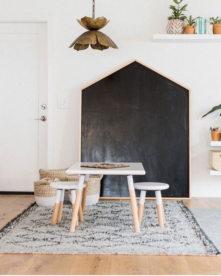
If you’re thinking: how does she keep a toy room in the main area without it looking like chaos? We hear you. Selena admits that the play space usually not completely neat and tidy—but she does try to keep the toys minimal in this space to cut down on clutter. She’s found that paring down the toys also keeps their attention longer during playtime.
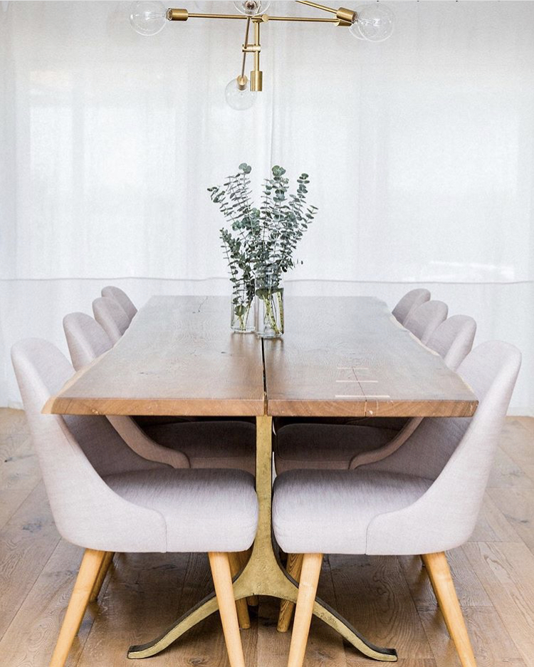
White is the base color for all of the rooms in Selena’s home—this helps the spaces feel bright and airy—and she adds color through accessories and furniture, and warmth through textures like plush rugs, pillows, and knitted throws. The use of mixed textiles on top of a neutral palette create a warm, rich, and inviting space for her family to spend time in.
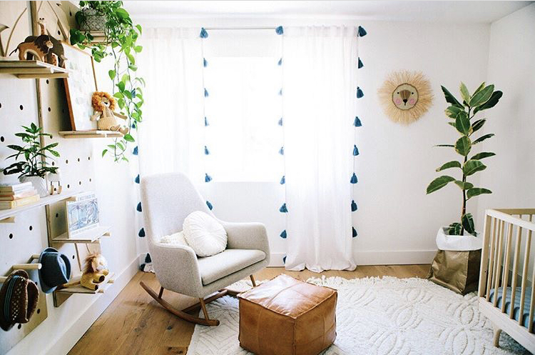
She also loves items that have a personality—a quirky or funky piece of decor adds character and helps your home tell your story. From the panther coffee table that she found on Craigslist to the striking jungle peg wall in her son’s bedroom—you can see Selena’s warm, friendly, and fun personality shine through her home.
Both Erin and Selena embrace the “less-is more” approach to decor: they focus on purchasing pieces they truly love, and leave the rest. (Plus, the clean lines and minimal clutter does wonders for a mom’s sanity.)
Erin’s Instagram Home Tour
Erin is the mom of two teenage boys. She has a background in real estate and art, and loves incorporating her artistic background into their interior designs. Like Selena, she also enjoys having an open-concept living space, so that when her boys are home from school, they can spend time together.
But achieving this open concept wasn’t easy.
When they first bought the home six years ago, the main living spaces were closed off from each other—lots of walls. The house also had a lot of brown and different types of wood, making it feel dark. But, Erin was able to see past the work that needed to be done, falling in love with the gorgeous view out the back window.
Because they loved this feature so much, they made adding large floor-to-ceiling windows a priority. She also incorporated a lot of white into her home to help make the home feel more spacious and bright.
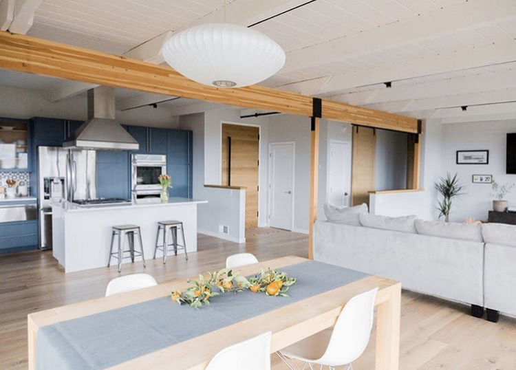
The photo above shows Erin’s renovated kitchen, dining, and living space. And isn’t it gorgeous?! In the video above, you’ll have to see her amazing before and after photos.
In the kitchen, they didn’t replace the existing cabinetry, but instead had the cabinets reconfigured and wrapped (an alternative technique to updating cabinets without painting them). They also added new lighting, backsplash and updated the hardware as well.
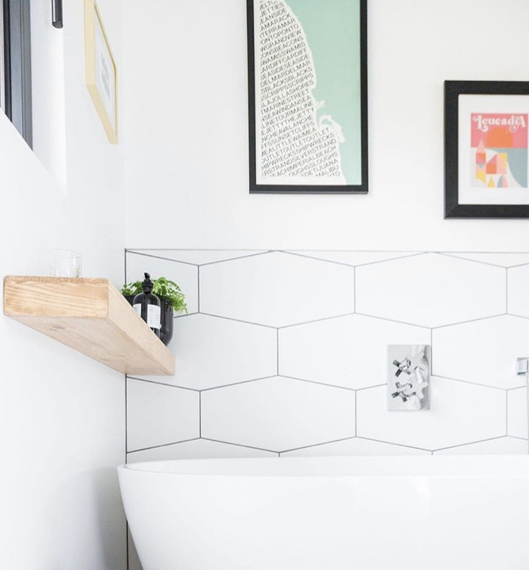
Another priority for Erin was updating her bathroom. As a mom, she recognizes the importance of practicing self-care, and for her, that’s a nice large soaking tub to decompress, relax, and unwind.
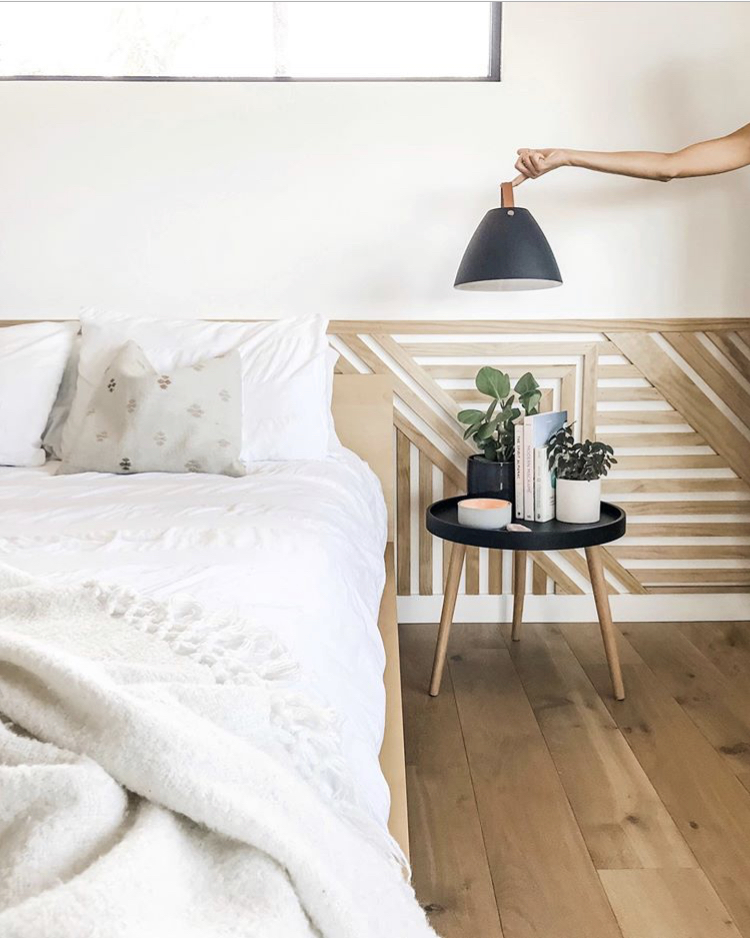
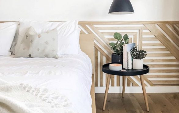
Her most recent project is working on her master bedroom. Above you’ll see the geometric wall that she created by hand using a saw and nail gun. It’s modern and sleek, and makes.a.statement. The pendant lights that she’s holding in the photo will be installed soon, and will hang down from the ceiling along both sides of the bed.
In this space, she opted for a neutral palette, adding some bright greenery through a couple of cute plants on the end tables—you can never go wrong with adding a few plants to a space—a little plant here or there is a quick way to breathe life into your home, helping to create a peaceful, relaxed atmosphere everyone will enjoy.
For more tips on interior design and ideas on DIY projects from Erin and Selena, be sure to check out their website and follow them on Instagram @fleurishinteriors.
If you like this look, you might also like:
