We moved into our home 4 years ago and have loved slowly making it our own. It feels like us, which I’ve come to learn is one of the goals in any home—to make it a true and unique reflection of the people who live within it.
It was built in 1960 and has tons of quirks about it, most of which I love; and a few, well, not so much. The primary bathroom and closet were among the quirkiest, with a wall between the two vanities, mismatched mirrors and light fixtures, and an increasingly moldy shower. Overall, the whole area was a poor and inefficient use of space that had tons of potential with a little creativity and maneuvering.
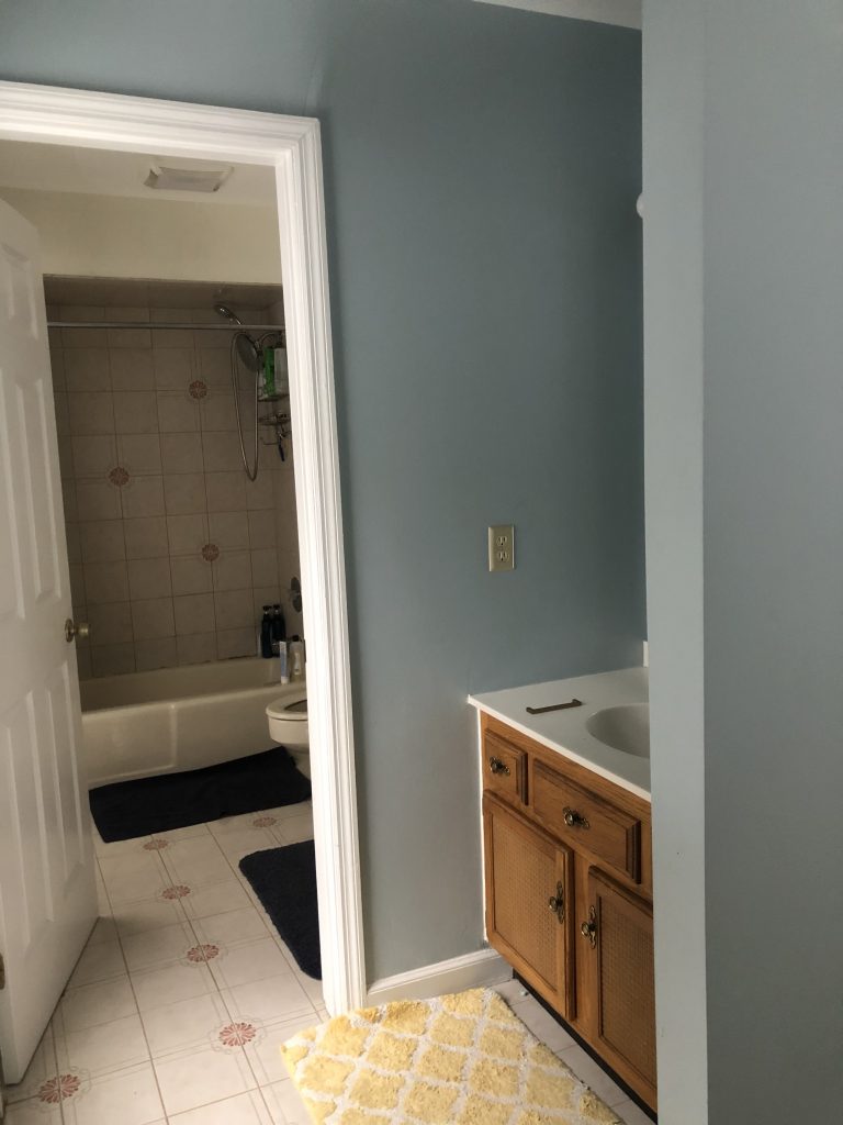
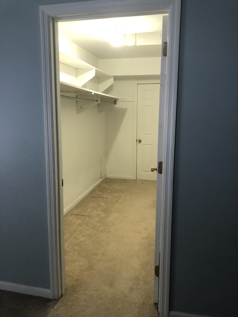
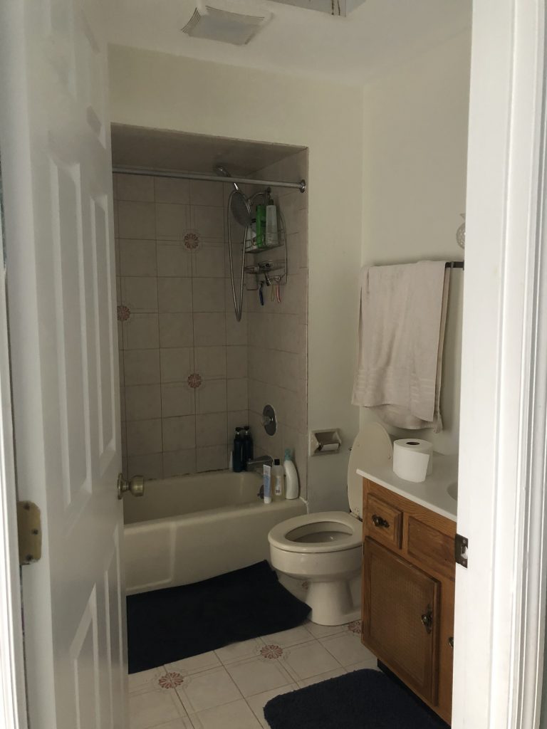
We knew when we moved into our house that one day we’d love to renovate it, and I’m so glad we waited a few years and lived with it as it was so that we had a clear vision of how we wanted the space to function and flow. Plus, I had ample time to hone my style and learn what I gravitate towards over and over again despite current trends. I’m grateful for those years of waiting that have brought me to a place of confidence in my personal style, not easily swayed by what a given designer is doing or a bullet list of trends an article deems “in”.
Every little decision along the way will become much more effortless and easy once you’ve thoughtfully cultivated your own style.
I truly think before you begin any renovation, however big or small, it’s pivotal to do the inner work of discovering what you alone like stylistically, practically, and functionally—regardless of any outside noise or influence. Every little decision along the way will become much more effortless and easy once you’ve thoughtfully cultivated your own style. Then once you’ve come to this place of discovery and self-awareness, you can allow yourself to be inspired by other designers, online photos, or real life friends that don’t change the foundation of what you’ve already built, but simply enhance it and add to it.
When we began the renovation process of our primary bathroom and closet, I had a clear vision of just how I wanted the space to feel, look, and function. We would be working with my uncle, who is a retired engineer and teacher turned contractor/house-flipper, and although it is some homeowners nightmare to be involved in every tiny decision along the way, it was my dream. I absolutely loved and valued the time we spent coming up with renderings, researching paint colors, light fixtures, shower tiles, and faucets, and visiting local vanity warehouses to get the best bang for our buck.
And even though I had a one month old, two year old, and 3 year old at home, I loved being consulted every time a new challenge arose and we had to pivot and problem solve. I had the freedom to let my creativity soar and really make this project my own. I know this isn’t everyone’s ideal situation, but it was mine.
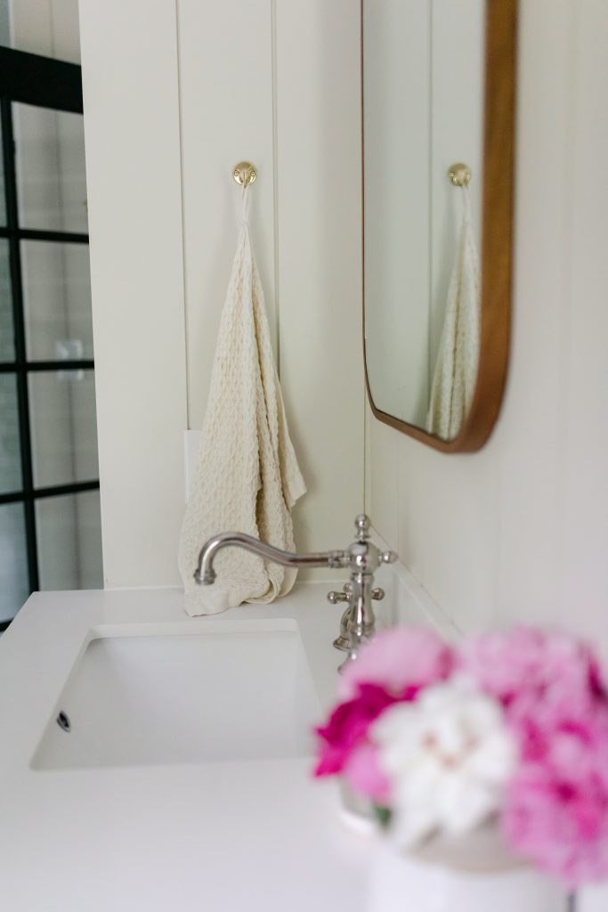
The vision in my head was clear: I wanted it to be classic, timeless, bright in the morning but cozy in the evening, and complimentary to the rest of the house. I have always gravitated towards bright and clean whites, the sparkle of brass, the calmness of creams, the warmth of wood, and the richness of a good green or blue.
I love mixing old and new, adding texture, and maximizing coziness. Since this was a bathroom renovation, the main feeling I wanted upon walking into it was clean and classic. I realized when I was researching paint colors that although I love a rich, bold color (which we ended up doing in our bedroom), I wanted something brighter in the bathroom since this was where I’d be doing my makeup in the mornings and the first place I’d walk into when I wake up—something practical I’m glad I took into consideration in the end. I landed on Shadow White by Farrow and Ball, which I had color matched at Sherwin Williams.
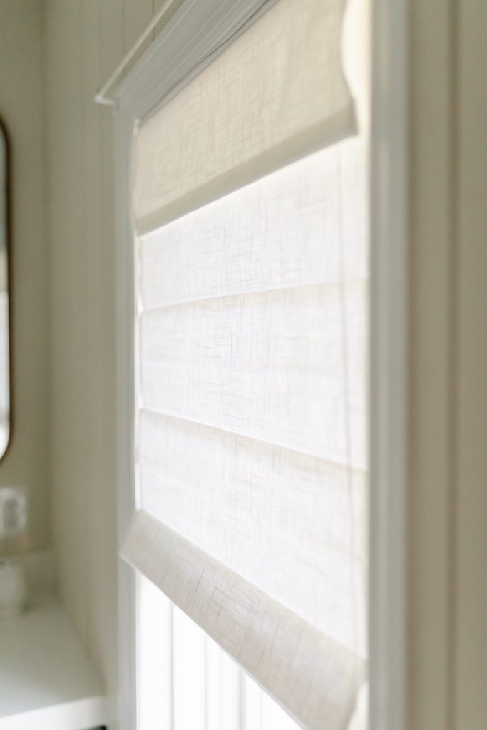
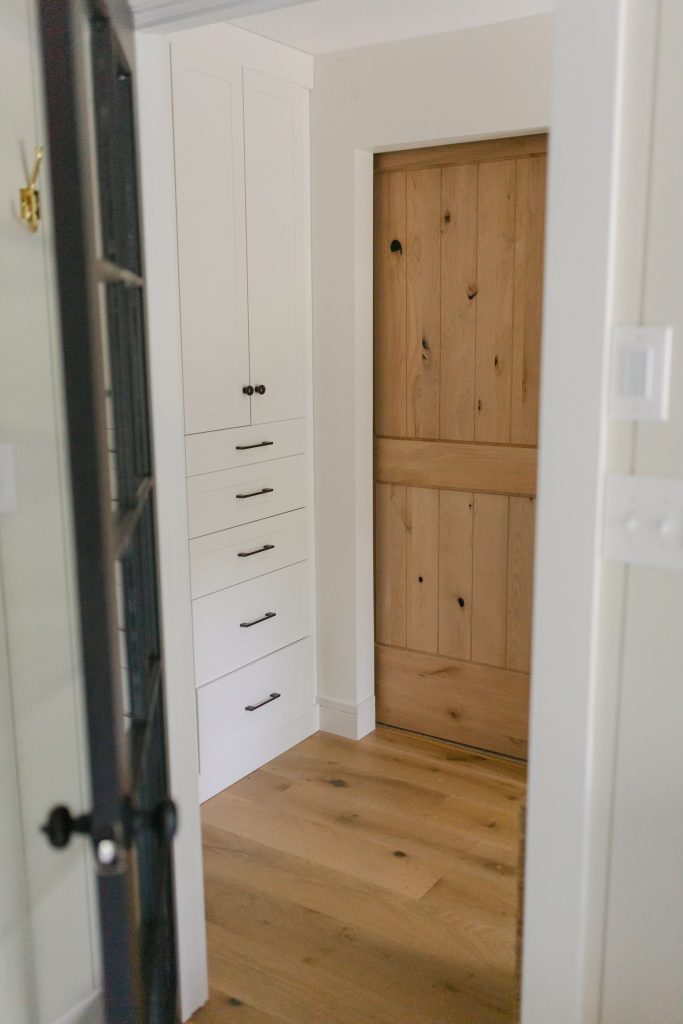
Another stylistic choice I love but didn’t make sense in a bathroom was wood flooring. My uncle advised against even engineered wood flooring for obvious reasons my designer brain hadn’t thought about (moisture, duh). So instead, I decided to incorporate that in the closet and couldn’t be happier with how beautiful and affordable this particular brand of engineered hardwood was.
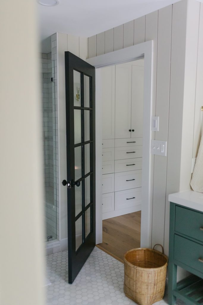
For the bathroom flooring, I went back and forth between a few options, but from the start had my heart set on hexagon tiles. There is something so timeless about hex tiles, and I knew I’d still love this floor in 50 years.
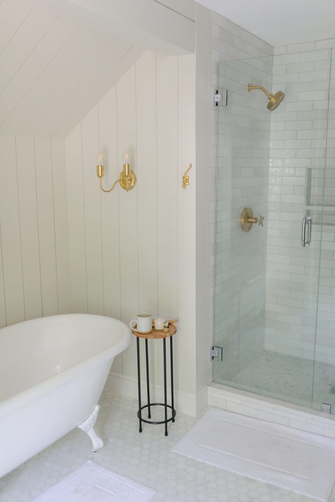
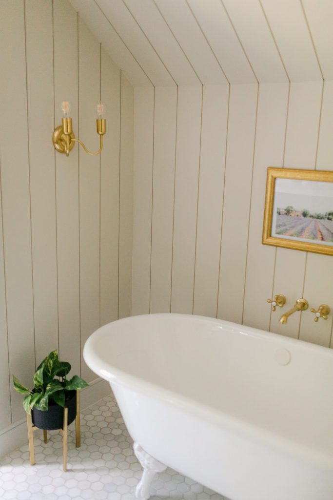
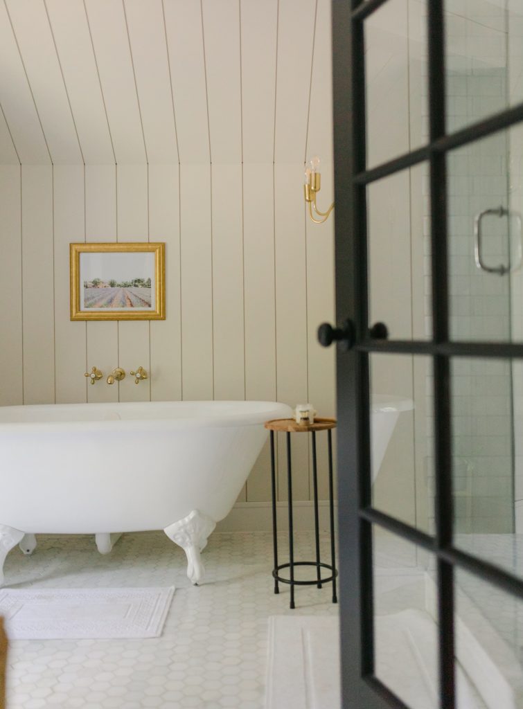
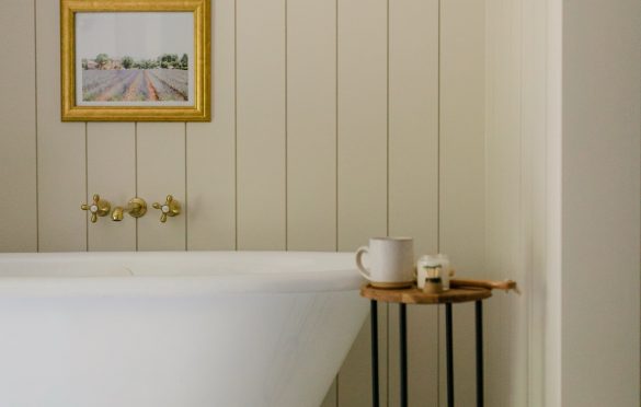
For the tub, we went with a white porcelain clawfoot—the crowned jewel of the bathroom and where we decided to splurge a bit. The layout of our bathroom included the sloped ceiling on one end because of the angle of the roof, so I knew I wanted to tuck the tub in that space to make it look like it was an intentional design decision.
With our many renderings we worked on with my uncle, this design element always remained the same. We continued the vertical shiplap seamlessly from the floor to ceiling to create a cozy nook, and then added the candle-like brass light fixtures to frame the tub on either side. I couldn’t be happier with how that vision came to life. It is by far my favorite part of the bathroom and the best place to end a long, hard day.
My husband was the main driving force behind the big shower, which ended up being possible after we discovered we could enlarge the footprint of the bathroom by building into some unused crawl space in the adjacent bedroom. I spent hours researching zellige tiles for the shower walls, which is a white terracotta tile made up of dozens of shades of white including – grays, creams, pinks, celadons and even blues. It has a stunning weathered look to it and every single tile is slightly different, giving it an incredibly natural feel.
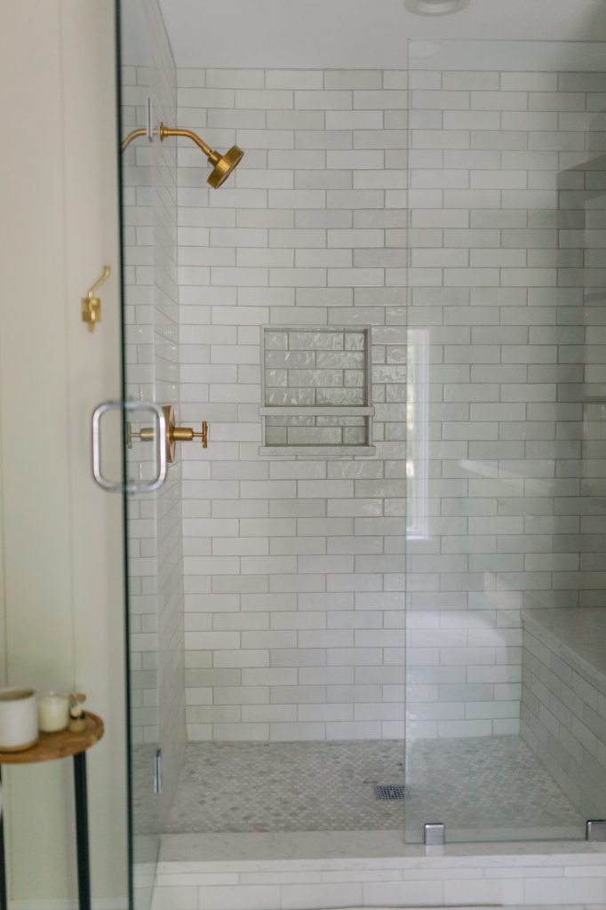
But of course that type of tile is not inexpensive and was way out of our budget, so I had to get creative. I ended up finding a tile from Bedrosian Tile with a similar look and a fraction of the cost. I love how each tile still looks slightly different from the next and compliments the floor well. I decided to carry the brass from the light fixtures into the showerhead and towel hooks.
Since most of the bathroom was cream, gold, and brass, I really wanted a pop of black somewhere to create some contrast. I found an inexpensive unfinished French door that we painted SW Tricorn Black and I love how it turned out. It adds just the right amount of contrast and a little drama to the whole space.
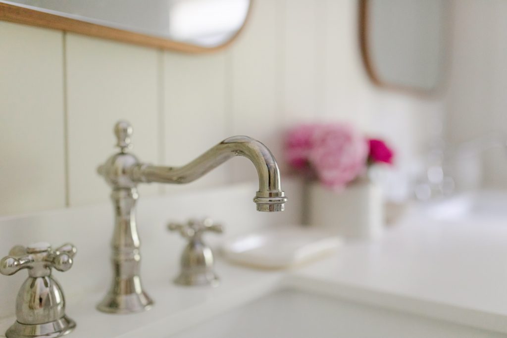
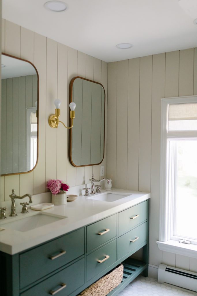
Finally, the vanity was an unexpected find at a local warehouse and one of my favorite design elements. It was also an area where we were able to save some money, as the vanity cabinets, countertop, and sinks all came in one package deal. The cabinet color is Lafayette Green by Benjamin Moore.
I chose the polished nickel faucets even though there seems to be a lot of hesitancy out there about mixing metals–even my uncle opened the package and thought I ordered the wrong faucets. I love the look and timelessness of nickel in a bathroom, and I thought it actually complimented the brass light fixtures well while adding some interest and surprise to the design. The walnut mirrors also added some texture and richness and allowed me to pull in some wood tones that I always love to incorporate in every design project.
I found both the wastebasket and the small table at an antique shop, and the artwork above the tub is just a digital download I printed of one of my favorite places–the lavender fields in Provence. And the peonies are fresh from my garden!
My hope in sharing our renovation process is that you will feel inspired to use your own unique creativity and slowly, over time, begin to cultivate small spaces within your home that you love and that serve your family well. Whether it’s an entire bathroom and closet, or just a little nook in your living room, everything you need to make your home beautiful is within you: your individuality, creativity, style, and particular needs will guide the process and lead you to create something lovely and uniquely your own. And that is what lasts in the end.
Thank you for sharing. I love this space and the finishes you chose! Can you share the dimensions of your shower and bench inside? I have a master bath I’d love to remodel someday, too! 🙂