At EM, we’re dedicated to celebrating the creativity and vision of homeowners and designers alike. Our home tour series offers an inside look into the spaces that have been transformed with love and ingenuity by moms across the country. Through these tours, we hope to inspire a sense of community and appreciation for the art of design, underscoring that homemaking is not a one-size-fits-all comparison endeavor but a deeply personal and unique expression of each individual family.
We’re excited to bring you this interview with Dava of @Wool.on.Oak, who’s shared with us her incredible journey of revitalizing a historic 200-year-old colonial home. Read on to learn more about her design choices and the stories that have made her home truly special. We hope you find this tour as enlightening and inspiring as we have!
Tell us about the history and transformation of your home. What was the original state of your colonial home?
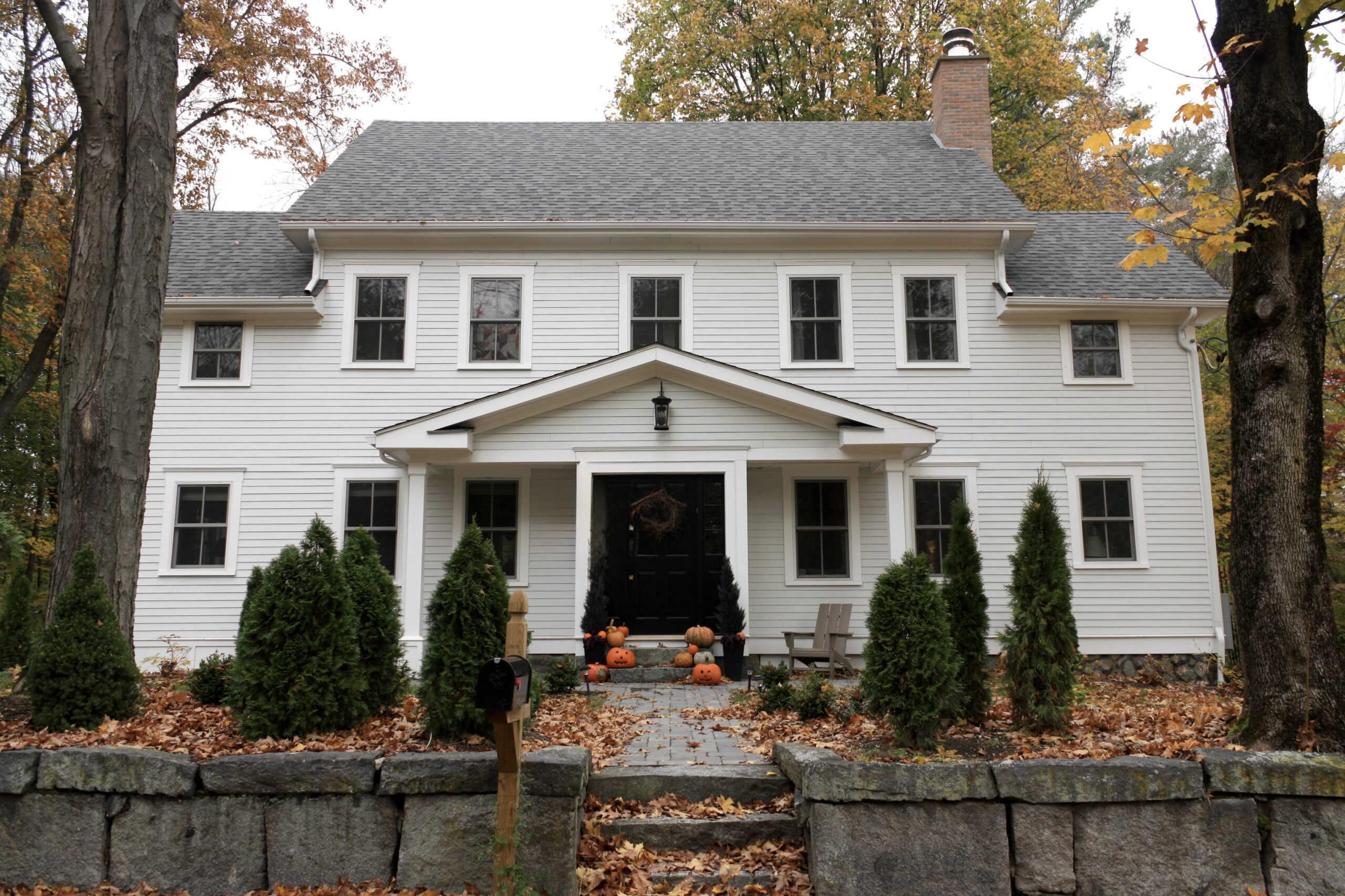
The original home that we bought was a 200 year old home in a Boston suburb, presumed to have been a doctor’s house and subsequently a cobbler’s. During a very complicated renovation, we ended up taking the house down to the foundation and rebuilding it with the same footprint. So, long story short, our house is just two years old! We modeled the new house after the old one, which was an early American colonial.
After taking off the roof on the second floor, it became clear that the extensions and work done over the years had done a number on the structural integrity of the house. We had the choice to either reinforce the house (which was very much not square) or to let it fall in on itself and reframe (which ultimately would take much less time, a consideration for us because we were living in a small condo at the time and had just had our second child).
We decided to reframe, and our contractor sent us a picture of the house – leveled to the fieldstone foundation – while I was still in the hospital after just giving birth after having a known Covid exposure. It was quite a wacky time for us!
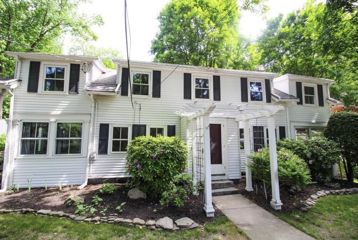
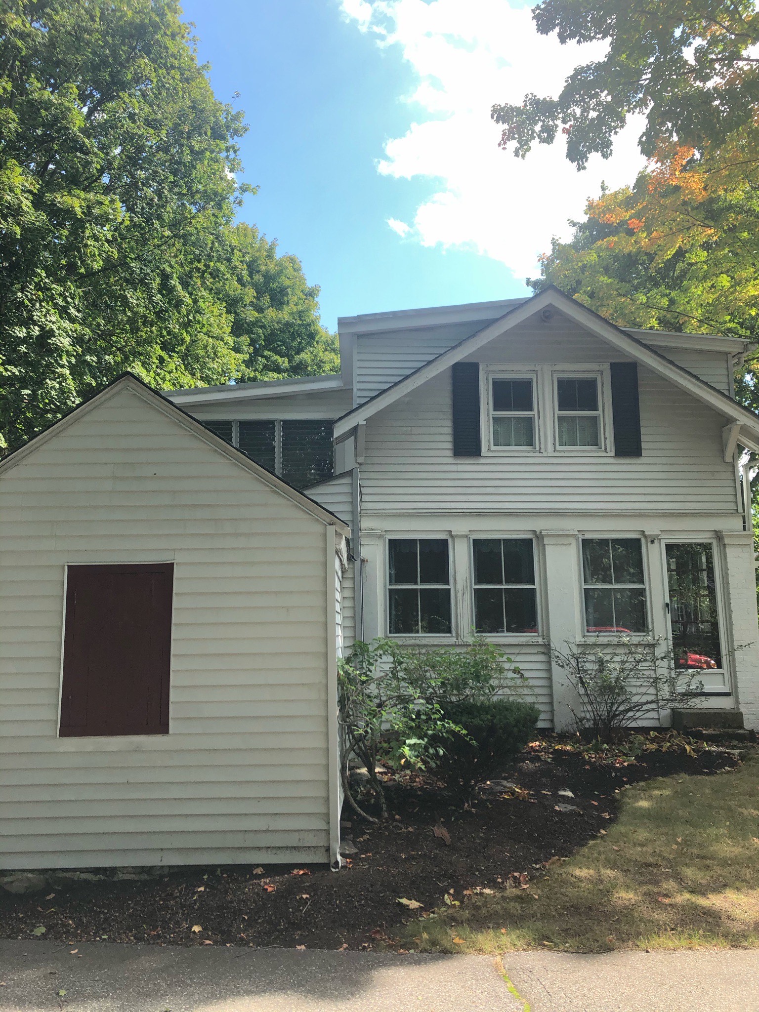
“Before” Exterior Photos
“After” Exterior Photo
What drew you to this particular property, and did you incorporate any unique or custom features into the home during the renovation?
The main draw of the home was the plot – we’re on a half acre that abuts wetlands and another half acre of undeveloped forest. The property has an abundance of very old oak and maple trees, and is laced with old stone walls that bring so much charm and character for a house right in the middle of the suburbs. As for the house – it had a lot of issues but the size and general layout was really great.
When we rebuilt, we kept it very much the same for that reason.
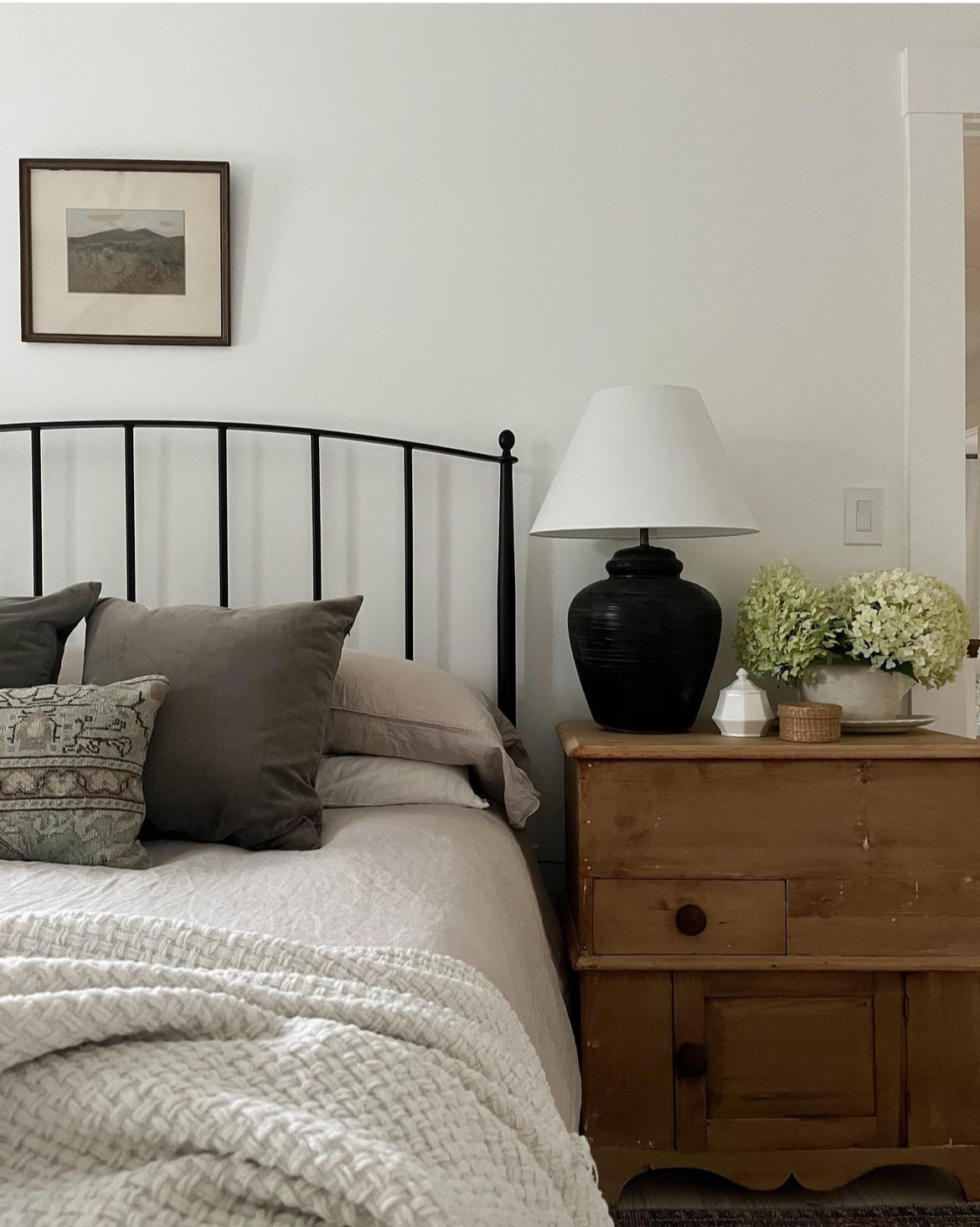
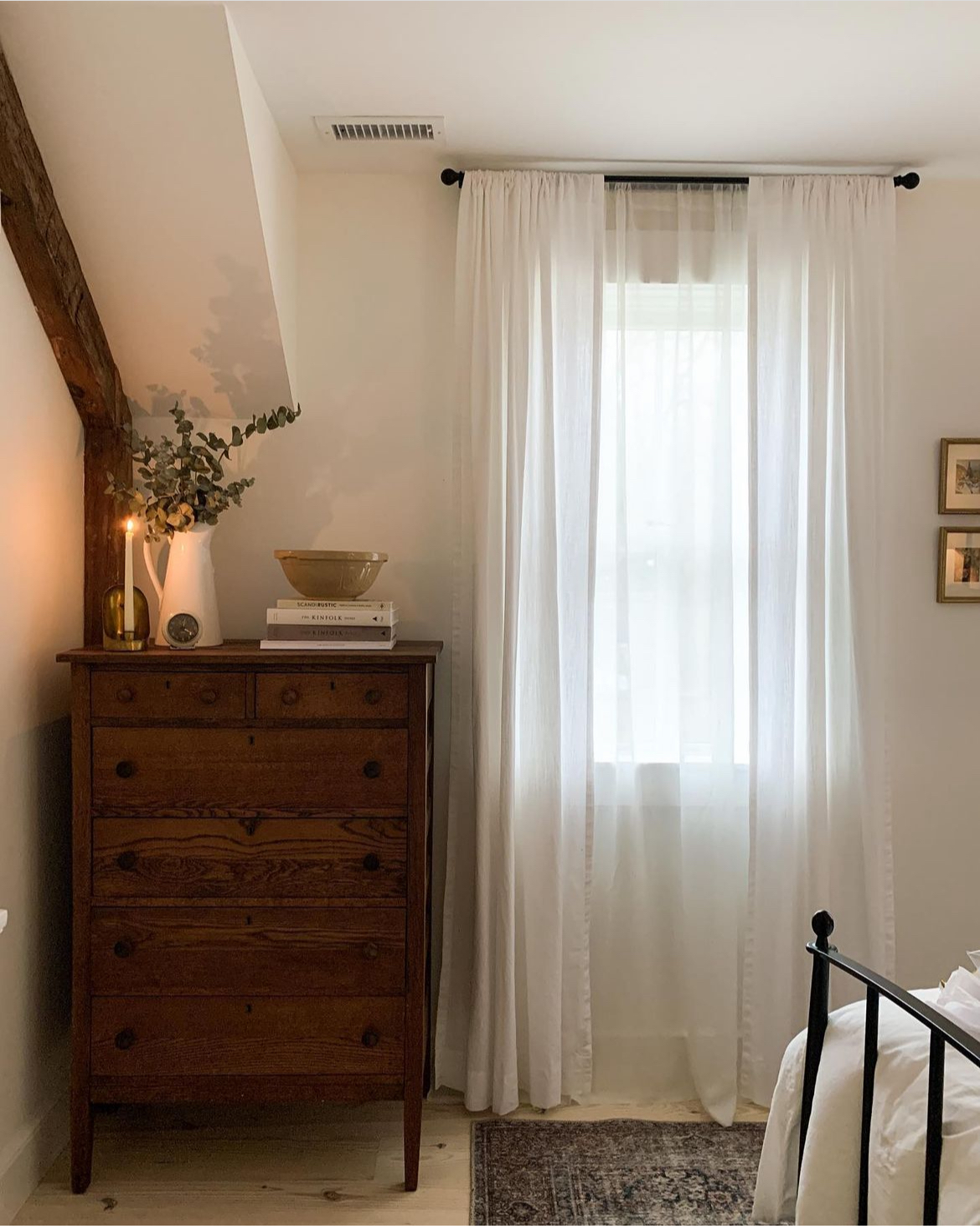
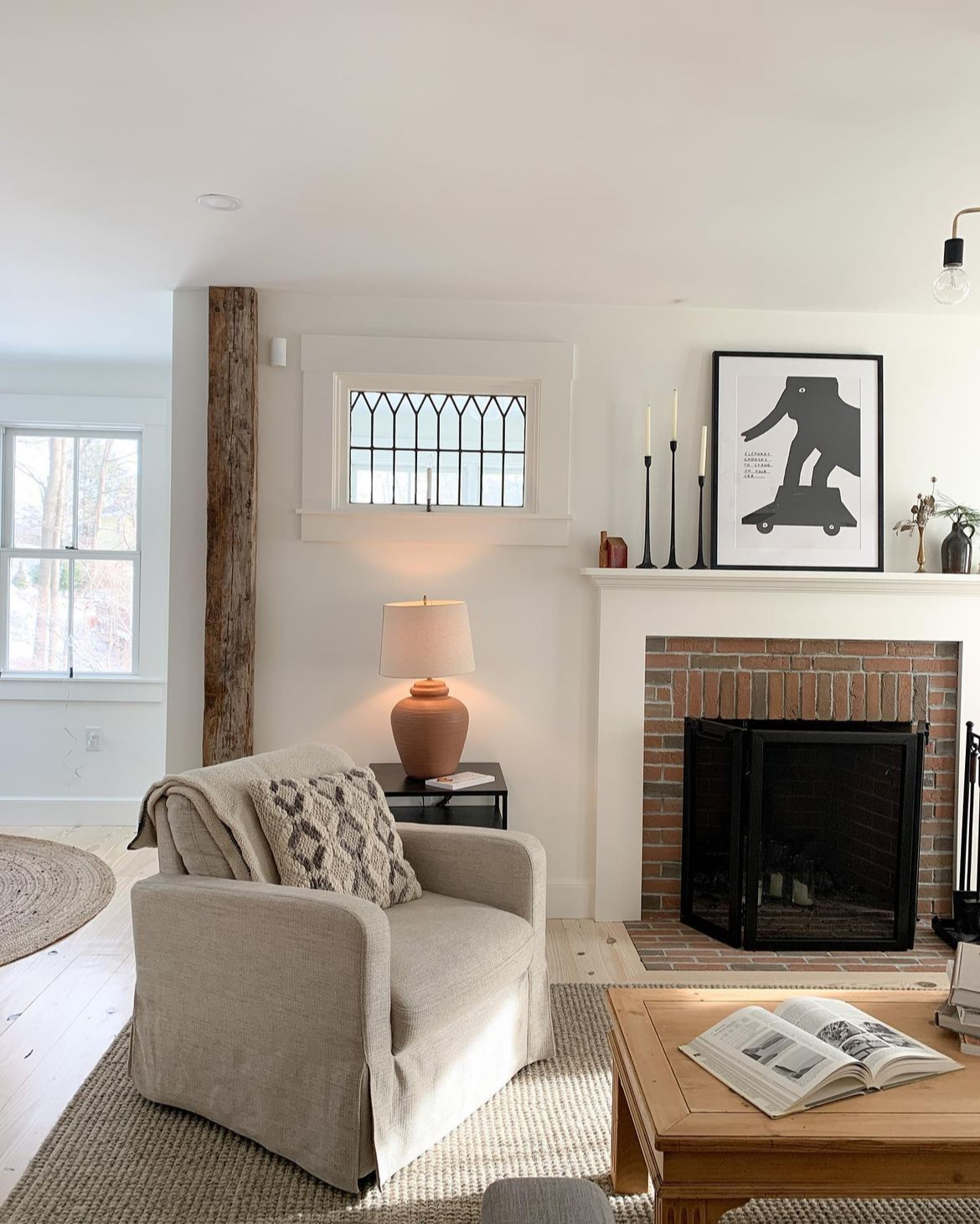
After rebuilding, we did incorporate the original 200-year-old hand-hewn posts and beams, some 100-year-old ceramic lights, 1900s leaded glass windows and a set of old French doors with beautiful, wobbly glass and brass hardware.
Did you handle any DIY projects during the renovation, or did you contract out all the work? If so, could you share some details about the DIY projects that made a significant impact on your home?
This was never going to be a project we took on ourselves. At the onset, we planned to raise the roof (which had been altered – poorly – so many times that it had substantial structural issues and lead to clearance on the second floor of only 6.5 feet). We also knew that there were some foundation issues with the porches added on sometime in the early 1900s, and we wanted to turn those into four season living. The whole house had knob and tube electrical, it was insulated with newspaper, and a number of windows were broken.
After moving into a brand new house, I felt nervous about digging into some DIYs. I’d designed our whole house soup to nuts, and was comfortable with some DIY, but knew my skills wouldn’t measure up to the professionals. It took me about a year to feel comfortable taking on some of the projects that we either couldn’t afford during the build or didn’t think about doing until after we’d lived in the house for a little while.
After putting the first few holes in the walls to hang pictures, and some wallpapering and painting, the first of the more significant DIY projects was building our home office (which I just did again and I’m much happier with!), then I built a worktop in our sunroom/craft room, and the built-in bookshelves in our playroom. All these projects have made the house feel much more lived in and custom.
Can you share some insights into the specific design choices you made for your home that contributed to the overall aesthetic of your space?
Our entire home was painted with Benjamin Moore Simply White which is such a nice, slightly warm white. It warmed up the house, which otherwise felt a bit builder-grade. I gravitate towards white walls and a simple color palette because it helps me feel more relaxed and at ease. While I keep colors pretty basic, I love to add texture, like the painted pine boards we installed in the stairway or the painted brick backsplash.
I tend to be much more simple in my design preferences, but I still want our home to feel welcoming and comfortable and always prefer the “real deal” to the dupe, or nothing at all!
We spend most of our time in the kitchen/dining/playroom area, so I put a lot of attention into these spaces.
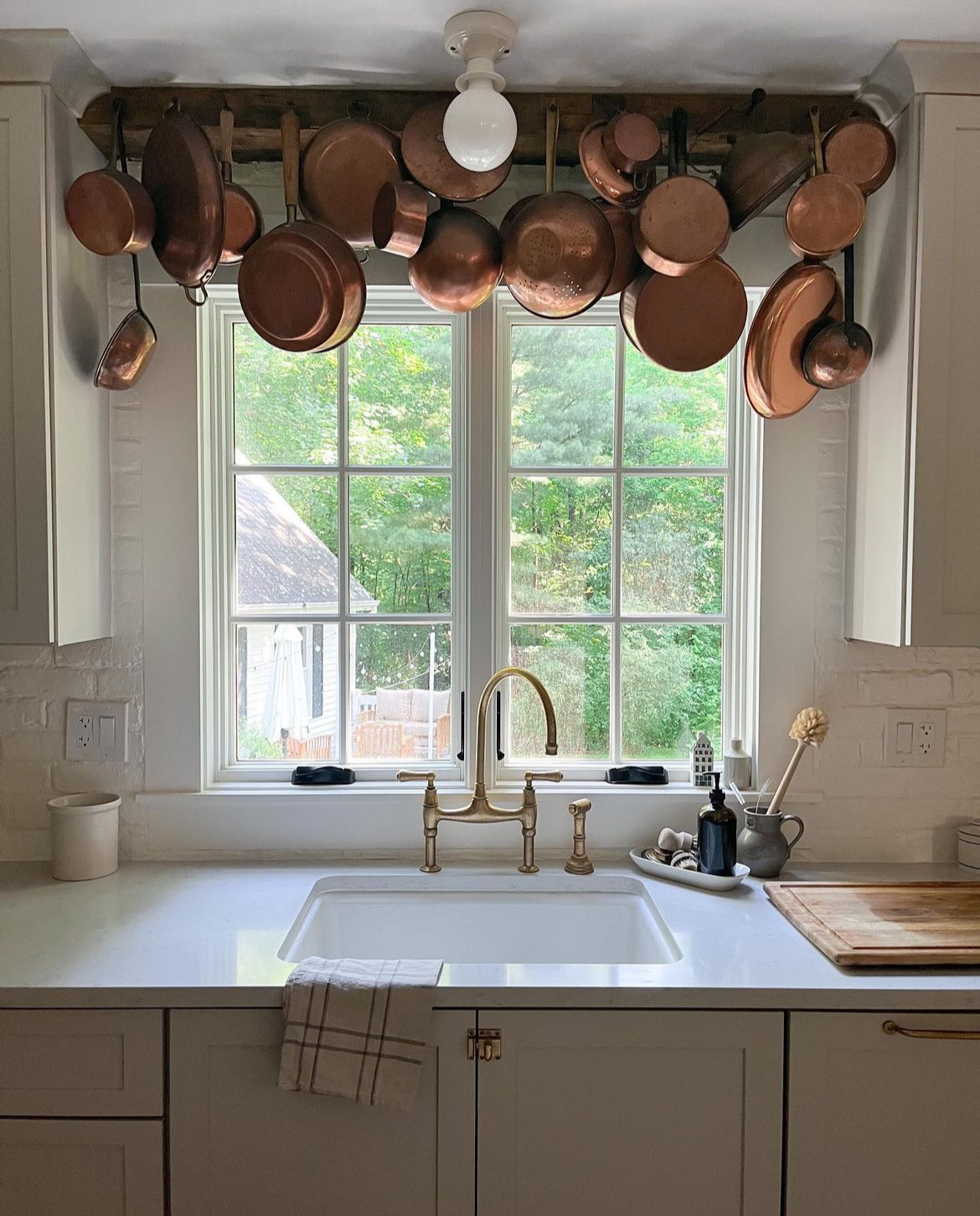
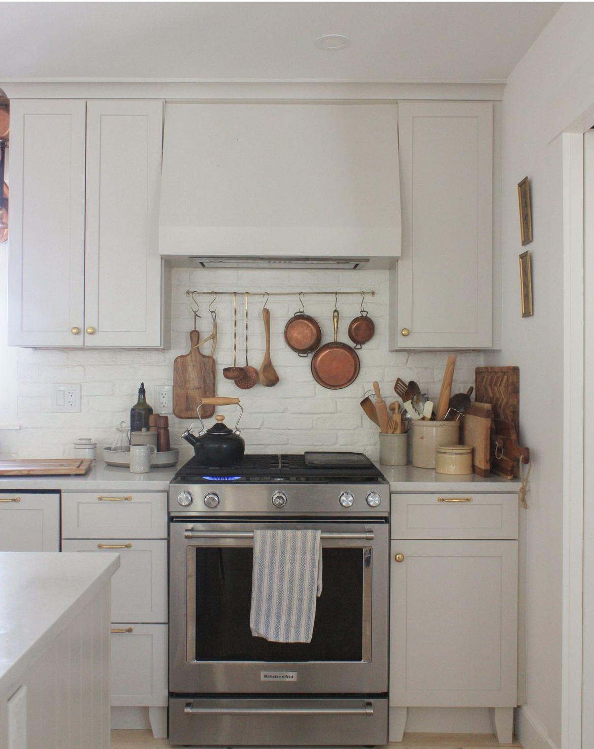
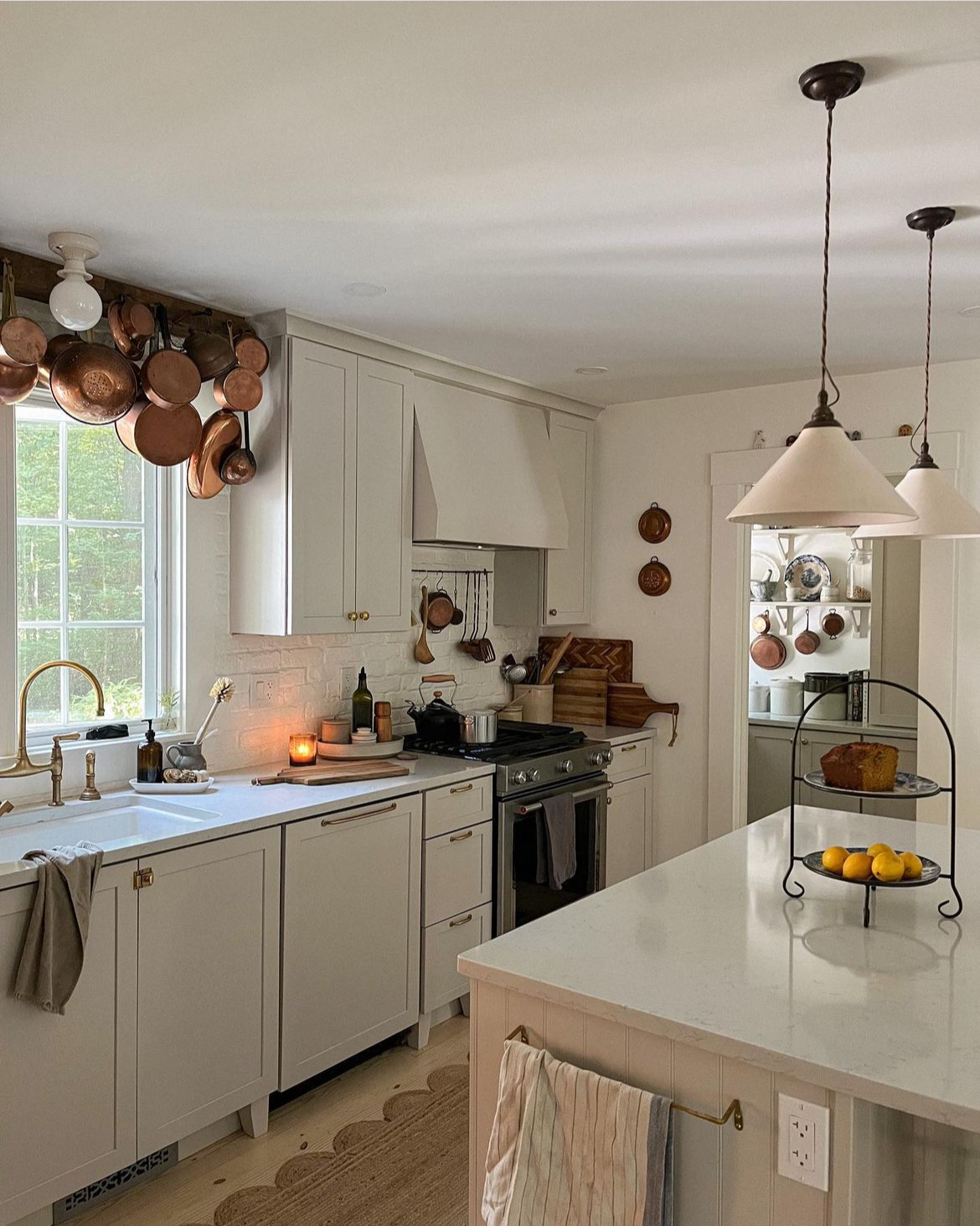
Our kitchen cabinets are a lovely warm grey color, which not only hides dirty fingerprints, but makes the kitchen feel less contemporary when paired with other finishes, like the quartz countertops and the stainless appliances. The unlacquered brass Perrin and Rowe kitchen faucet was a wishlist piece we managed to get on sale, and the Rejuvenation knobs were something we saved for. The patina adds so much character to the kitchen.
We scored a pair of DeVol pendant lights for reduced price as factory seconds (all I had to do was ask!) and I also opted to do brick backsplash instead of a subway tile, to give more texture and character. While I would have loved inset cabinets and an integrated fridge, we’re really happy with the kitchen we could make in our budget.
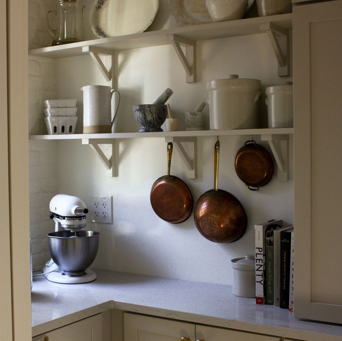

I recently built bookshelves in the playroom, which is right off our dining room (through the aforementioned old French doors) and painted them in a color match to the kitchen cabinets. It’s a long and narrow room, so it provided a much-needed grounding for the space. It also provides essential storage for books and all the kids’ activities. I put in the Chris Loves Julia Polly rug – I try my best to use natural fiber rugs throughout our home – and it is just perfect for a high traffic play space.
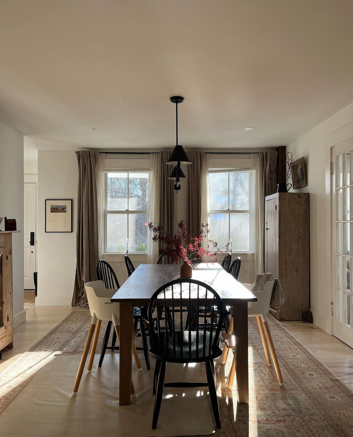
In the dining room, which connects the playroom and kitchen, lives an incredible antique pine cabinet that I got on Facebook marketplace. I love the piece so much, but I also love the really sweet exchange we had with the gentleman that sold it to us, who decided to give it to us for free after meeting us knowing it would “go to a good home”.
Aside from the main living areas downstairs, one of my favorite spaces is the primary en suite. Nearly every decision I made for this space my contractor questioned: beadboard to the ceiling? Two pedestal sinks instead of a vanity? A smaller shower so I could fit a tub? (I still think our shower is huge). Reclaimed beams? Marble floor tiles? From Lowe’s, no less! Old ceramic lights? Unlacquered fixtures? No handheld or rainfall showerhead?
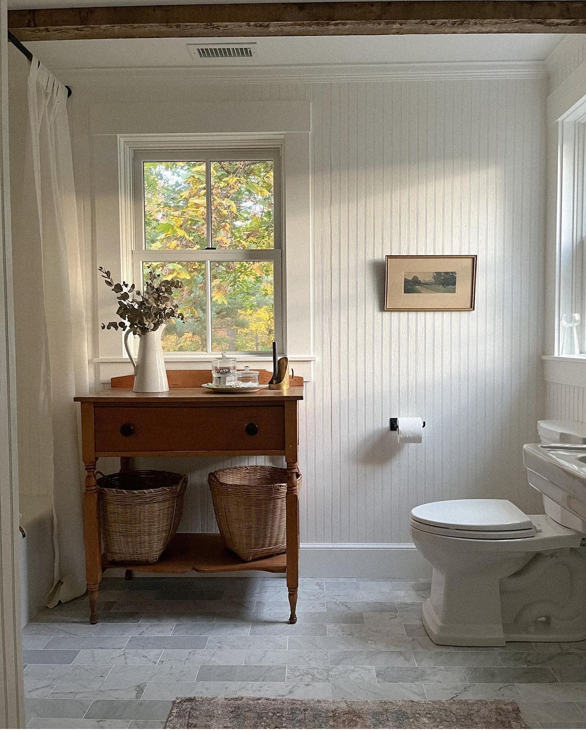
But I had a vision in my head and I didn’t stray the path.
The room is full of texture that makes a bathroom feel cozy, and the warm white walls keep it feeling clean and fresh. It’s luxurious without feeling ostentatious, and it’s indulgent without feeling over-the-top.
What inspired the design choices for your home? Did you draw inspiration from the original home or any specific architectural styles or sources when making design decisions?
The main inspiration for the new home was the old home. While a lot of renovations had stripped the home of its “original” details, it was a time capsule of home design. We took the same cue by doing almost everything inspired by shaker style homes, from the wide pine floors to the trim, door and window styles.
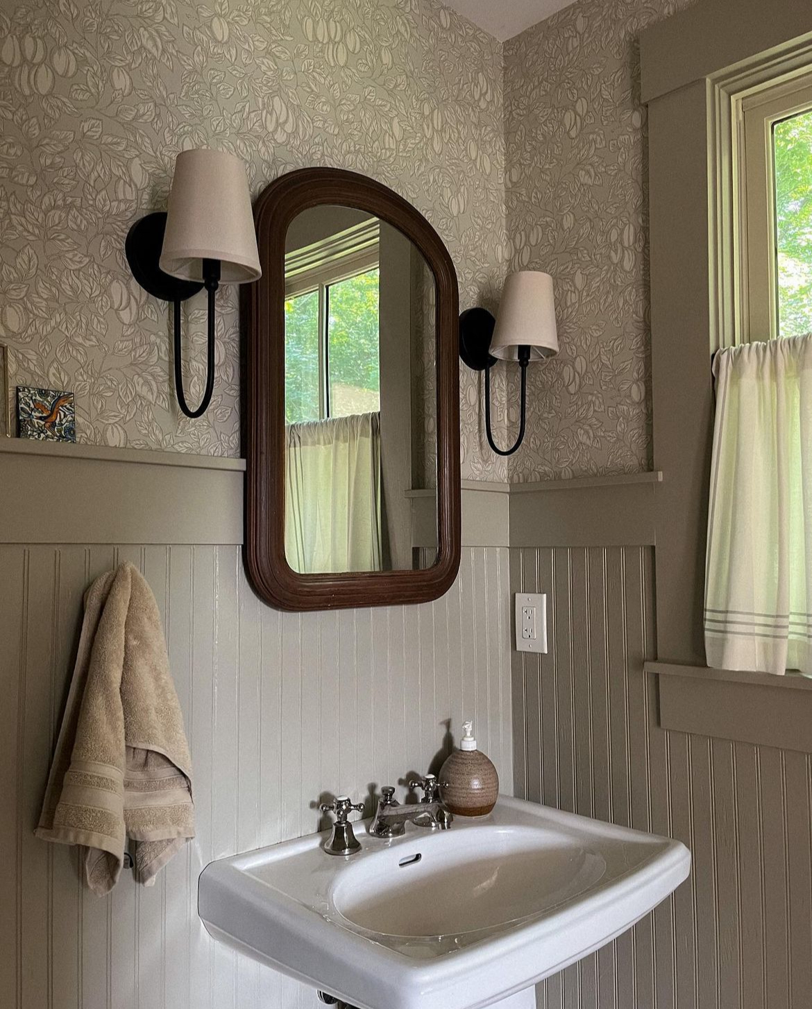
But we also did a few things you don’t often see in older homes, like staining our pine floors slightly white and sealing to look almost untouched.
Our baseboards are thick, which was uncommon in early American homes. Our ceilings are 8.5’ which feels generous enough but still in keeping with the low ceilings of early American homes. We have some rooms that flow into others, but honored the “boxiness” characteristic of old homes.
We added some features from the 1900s version of the house, our furniture style is much more transitional. I used the book Get Your House Right as a reference when making most of the architectural decisions, to learn the “rules” but also how and when to break them. I wanted something timeless and accommodating for the modern family. 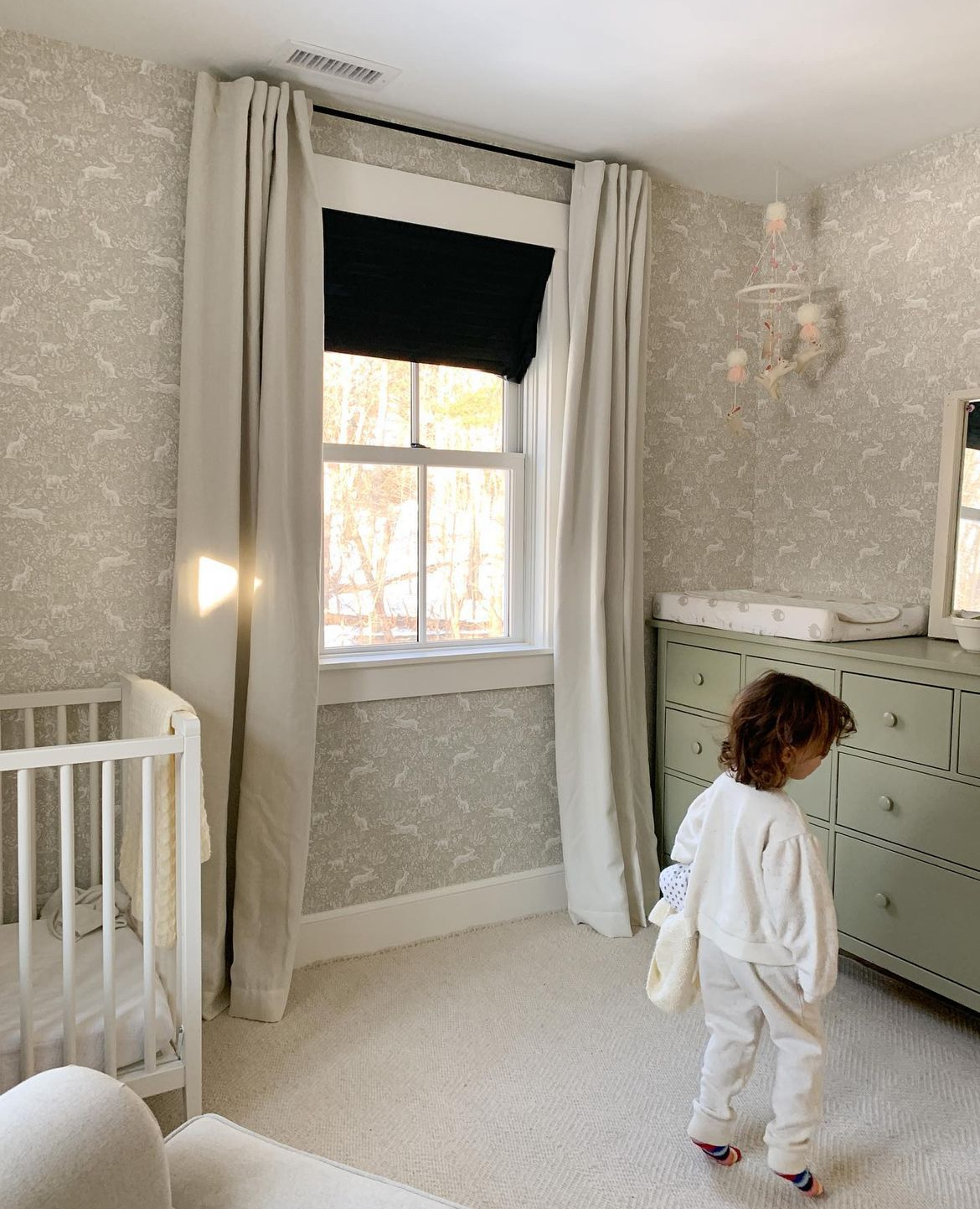
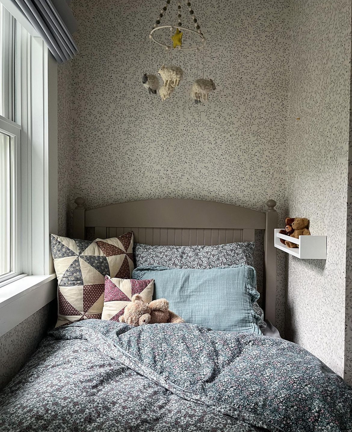
Our house is still very much a work in progress! While the temptation to go out and buy everything that you want right away, I love a collected home and I know that takes time. The depth that comes to a home filled with pieces that are unique, have a story, and are truly loved just can’t be bought in a catalogue.
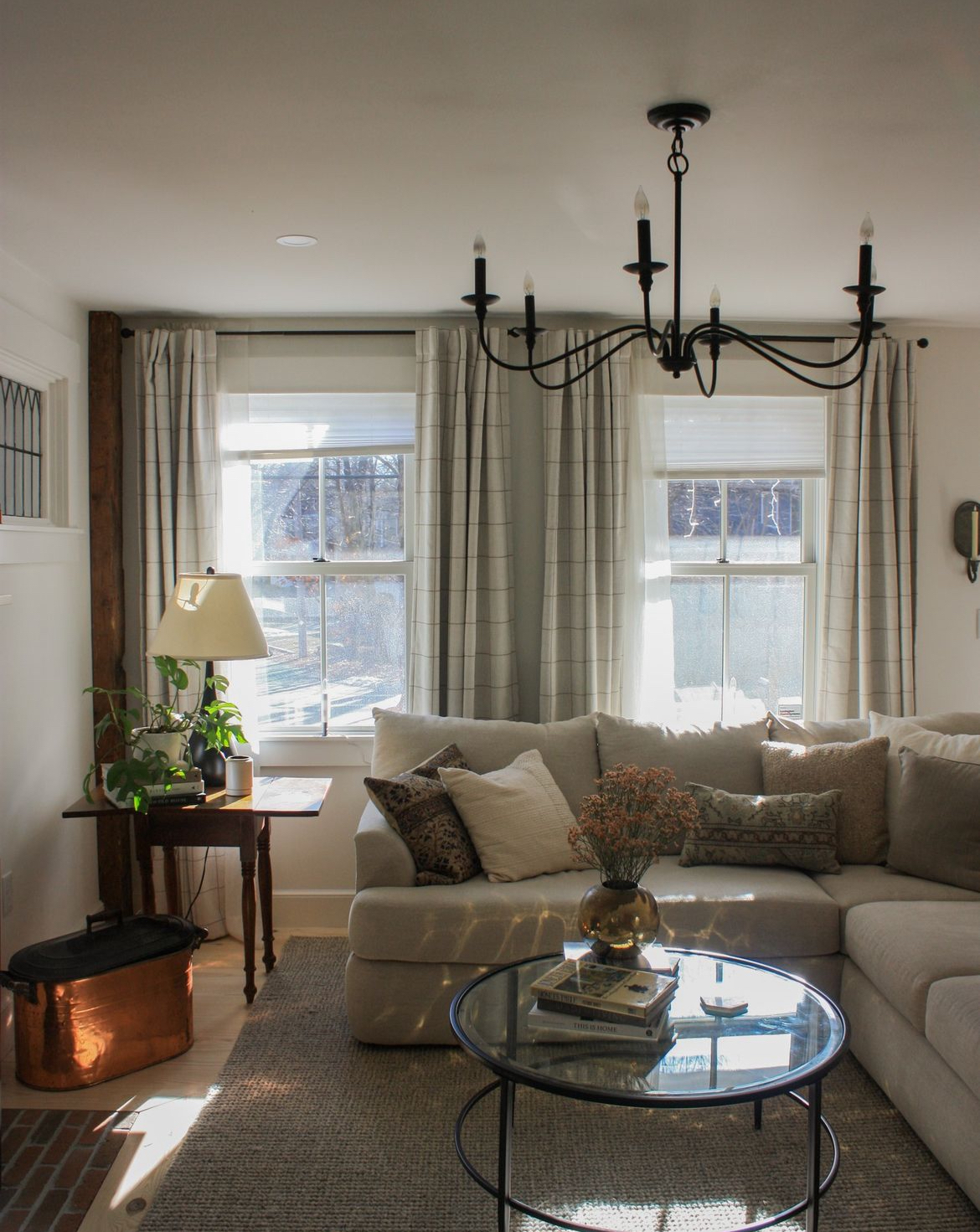
That said, I was very pleased when our long-awaited sectional arrived after moving because as much as I love collecting, this is a home for relaxing after all!
