


Photo by: Margaret Rajic
It’s been over ten years since our honeymoon in Ireland, but I still think about the bed and breakfast we stayed in during that trip. It wasn’t fancy or styled — not in the way we think of hotels today. The wallpaper was worn, the quilts were soft and a bit faded, and the armchairs in the sitting room didn’t match (but felt perfectly at home together). There was almost always a fire going, even in June, and the windows opened to fields dotted with stone walls.
What struck me most wasn’t any one “design moment,” but the feeling: cozy, layered, and entirely unforced. It was the kind of space that invited you to settle in, not perform & be “productive”.
That memory has stayed with me, quietly shaping the way I think about home — about how warmth doesn’t come from newness, but from the accumulation of charm. From rooms that feel collected over time, not styled all at once.
What makes a room feel like that?
As a designer, I find that studying the right details — the ones that layer charm and comfort without trying too hard — helps sharpen my own eye. The rooms I’m about to share aren’t just beautiful — they embody a cozy, timeless quality that aligns so closely with the kind of spaces I love to create.
Let’s take a look at five that get it exactly right.
1. The Wallpapered Bathroom That Doesn’t Try To Hard (Design by House Seven Design)
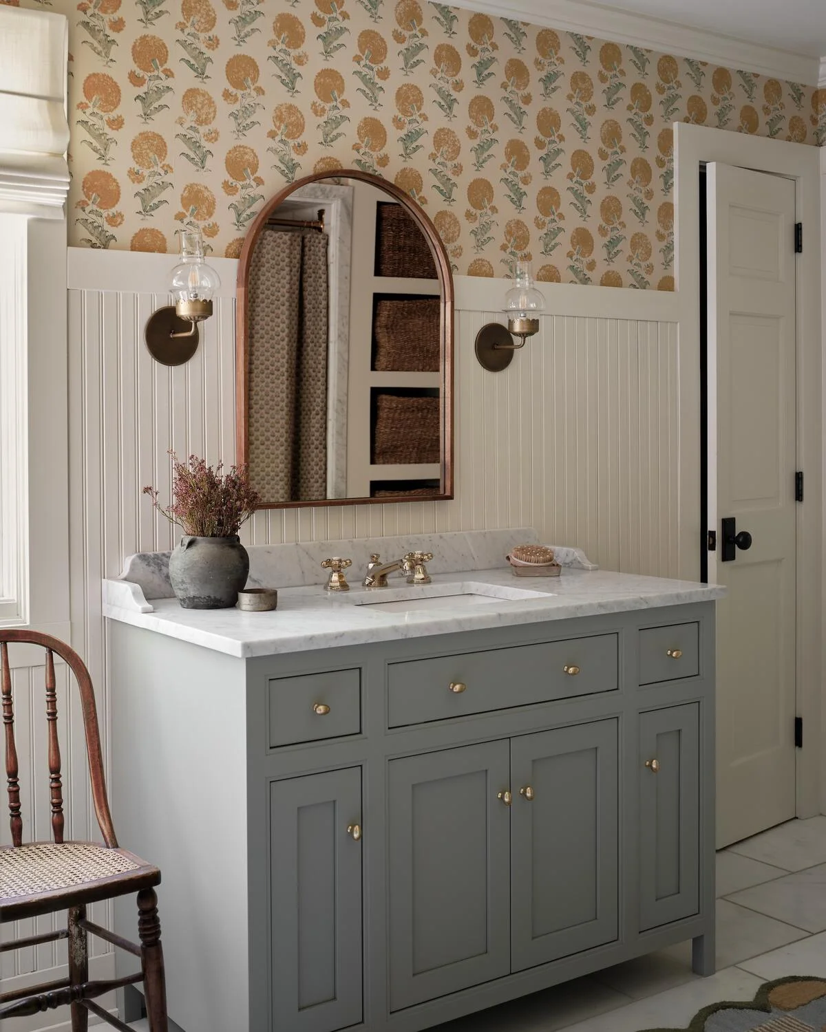
This bathroom looks like it belongs in an old inn you never want to leave. The dandelion-patterned wallpaper is cheerful, the vertical beadboard adds architecture, and the custom sage-green vanity with polished nickel hardware grounds it all. There’s a gentle curve in the wood-toned mirror that softens the straight lines — and that’s what makes it feel collected, not constructed.
Try this at home: Unexpected wallpaper in the bath, mixed metals (hello, brass, bronze & polished nickel), and don’t skip the details — even your faucet can have charm.
2. Pattern on Pattern — and Then Some (Design by MStarr Design)
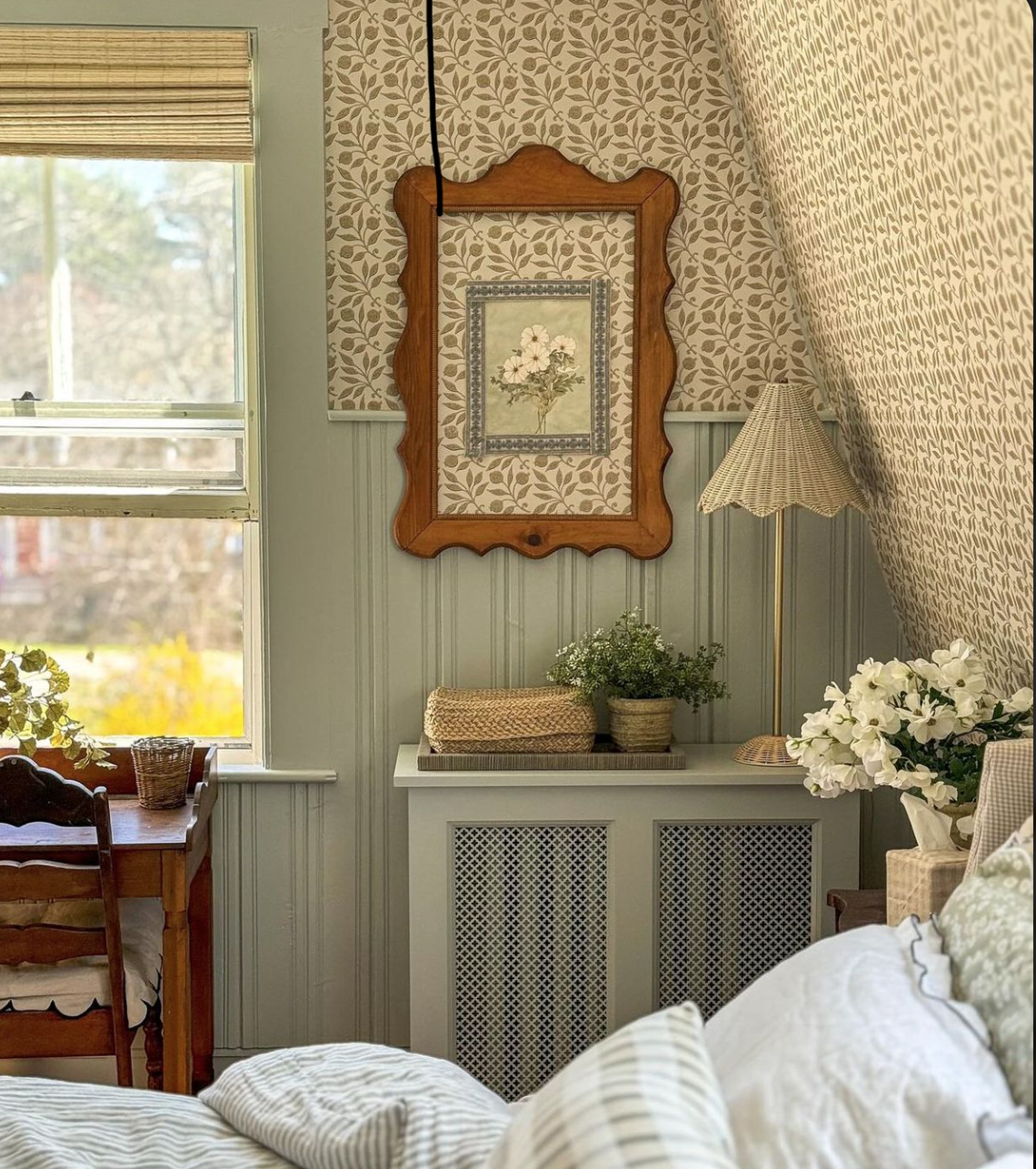
This bedroom nook look like a warm hug. Why? It doesn’t shy away from pattern or personality. Notice how the floral wallpaper isn’t contrasted with plain walls — it’s echoed with panelling, checkered linens, striped bedding, and wicker textures. Even the picture frame has character.
Try this at home: Layered textiles, charming florals, unexpected wood trim, and soft greens that work as neutrals.
3. A Kitchen That Leans Into Texture (Design By Block Brothers)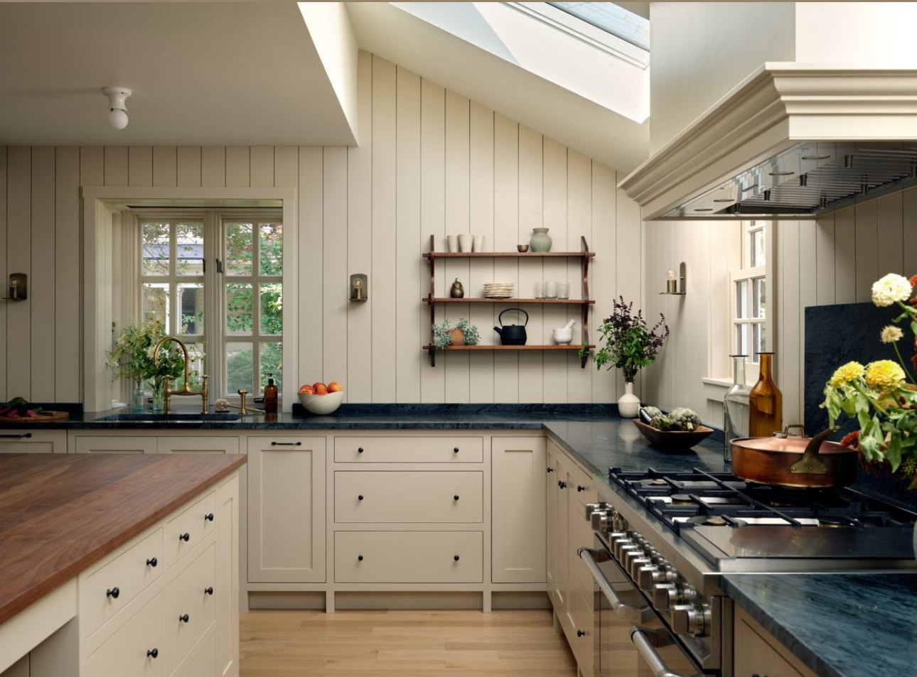
This space isn’t loud, but it’s deeply rich — quietly so. The V-groove paneling, honed slate countertops, and walnut wood island all speak in soft, textured tones. Even the simple pottery and open wood shelving add to the hush. The brass faucet feels like it’s been there forever, aging gracefully. That’s the secret of cozy: it’s in the layering. Overhead lighting, subtle sconces, warm taupe walls, and cabinetry that doesn’t shout — it all works because it’s rooted in natural materials and grounded, earthy color. This kitchen doesn’t feel stark — and that’s exactly the point.
Try this at home: Add visual interest to your walls instead of leaving them flat. Add paneling, moulding, tile, or wallpaper.
4. The Lived-In Living Room (Design by W Design Collective)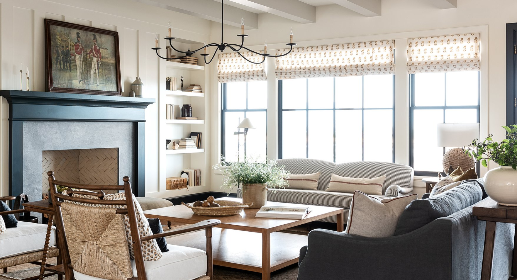
This space invites you to sit down with a book and lose track of time. The key? A thoughtful mix of materials. Cane, wood, metal, linen — they’re all here, and nothing feels too matchy-matchy. Take the two sofas: one’s an English roll arm, the other a more relaxed slipcovered style. They work beautifully together because they share a similar palette — soft blues that tie the room together. There’s a gentleness in the curves of the furniture and the vintage-inspired lighting. And don’t overlook the custom printed Roman shades — patterned window treatments are an often-missed opportunity in living rooms. The coffee table, with its clean lines and pale wood tone, adds just the right amount of modernity to balance out the space without weighing it down.
Try this at home: Drapes or shades with subtle patterns, oversized coffee tables with real wood grain, and layered lighting — overhead, table, and floor.
5. When Sweet Doesn’t Mean Themed (Design by Ashley Montgomery Design)

There’s something instantly nostalgic about matching Jenny Lind beds (we did a similar take here) — they whisper “childhood” in the best possible way. But what keeps the room from feeling overly sweet or styled is how it’s grounded: simple quilts, gingham pillows, and a subtle checked rug add just enough pattern and texture. The wood dresser and woven shade bring in natural warmth, while the symmetry of the space feels calm and effortless. It’s a room made for slow mornings.
Try this at home: Use symmetry to your advantage (especially with twin beds), add texture through rugs and window treatments, and balance sweetness with simplicity.
So, what are you missing?
If your space doesn’t feel cozy, ask yourself:
-
Am I using enough pattern?
-
Do I have a mix of textures?
-
Is there something unexpected? (Like a little framed print or basket of linens)
-
Does my room feel like someone actually lives here?
Cozy isn’t about clutter — it’s about layers. It’s about not being afraid of a stripe next to a floral. It’s about adding a lamp even when overhead light “works.” It’s about breaking up the bland.
And when in doubt? Add a throw pillow. Or a roman shade. Or a tiny vase of flowers. Or, ideally — all three. 🙂


