Katherine, her husband and two daughters weren’t looking for a house, but when they stumbled across this one, they couldn’t resist.
It’s a 7-bedroom, 1905 Victorian and Katherine said one of her first goals was to make the house feel a little more welcoming.
“I just felt like it was so serious, so many things about it were so intense and I wanted to lighten it up,” she said. “And we certainly don’t need 7 bedrooms!”
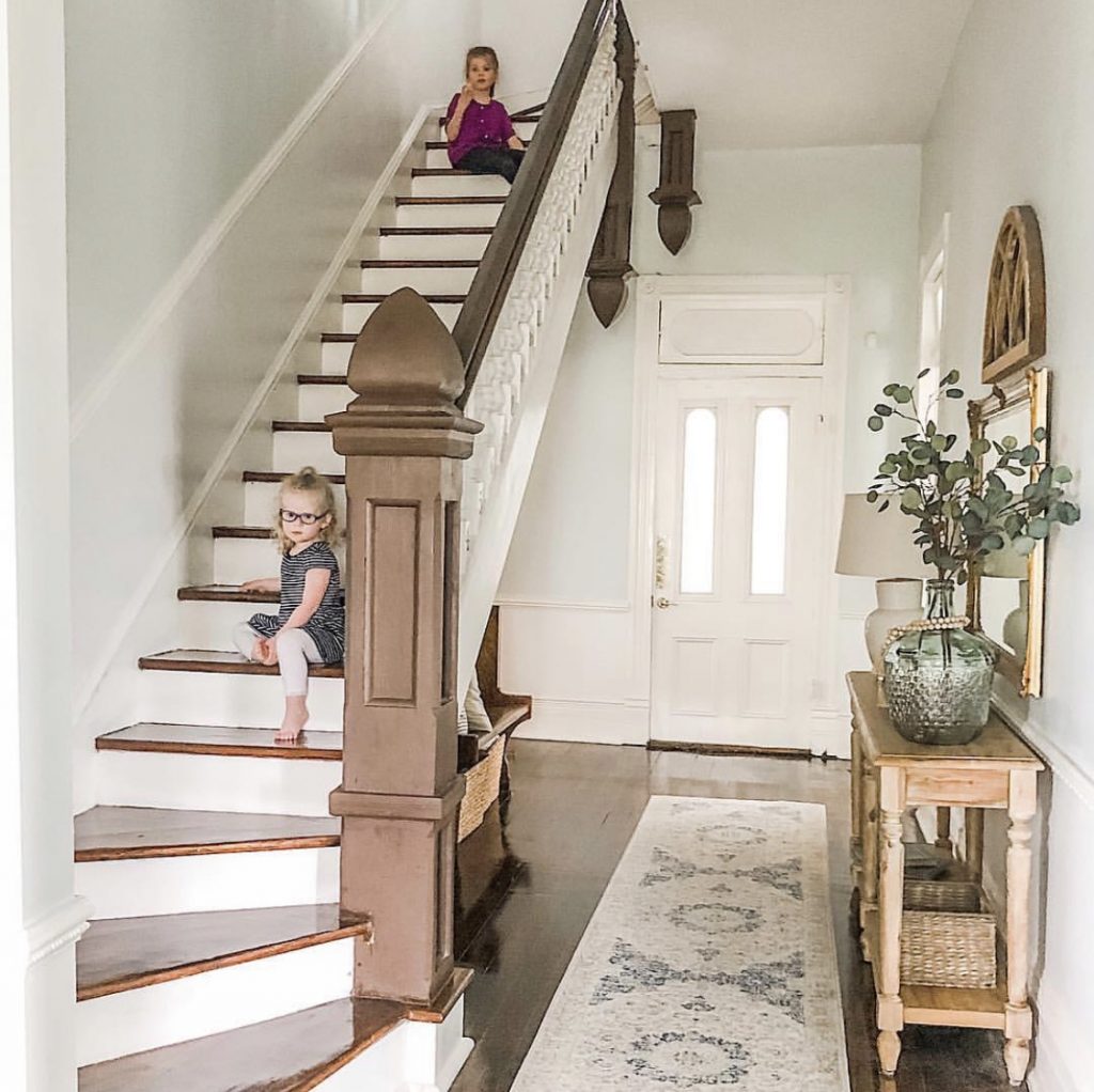
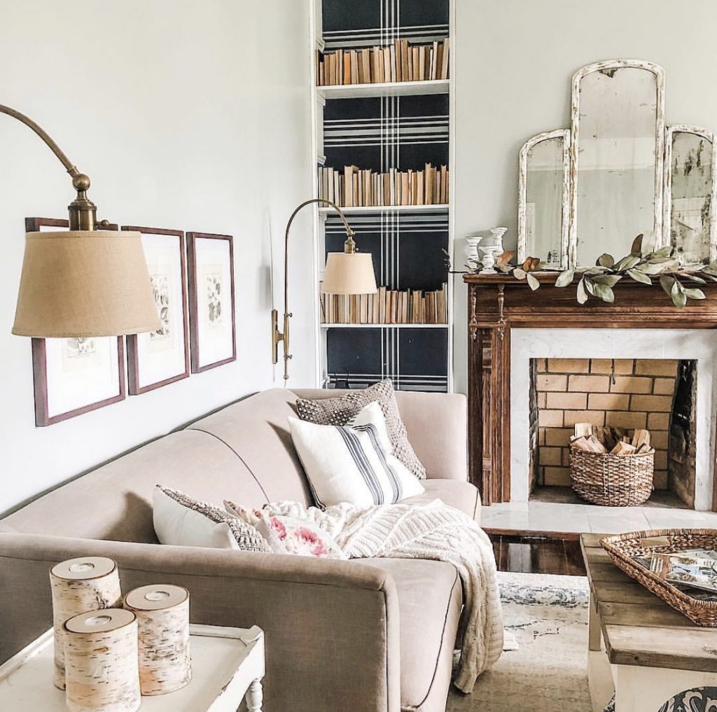
They have turned many of those bedrooms into other rooms they need — a guest room, an office, a playroom, a living room.
One of her first projects was the playroom, as she wanted her daughters to have a spot of their own right away. Filled with natural light, it’s such a sweet space that can easily evolve with the girls and their growing interests.
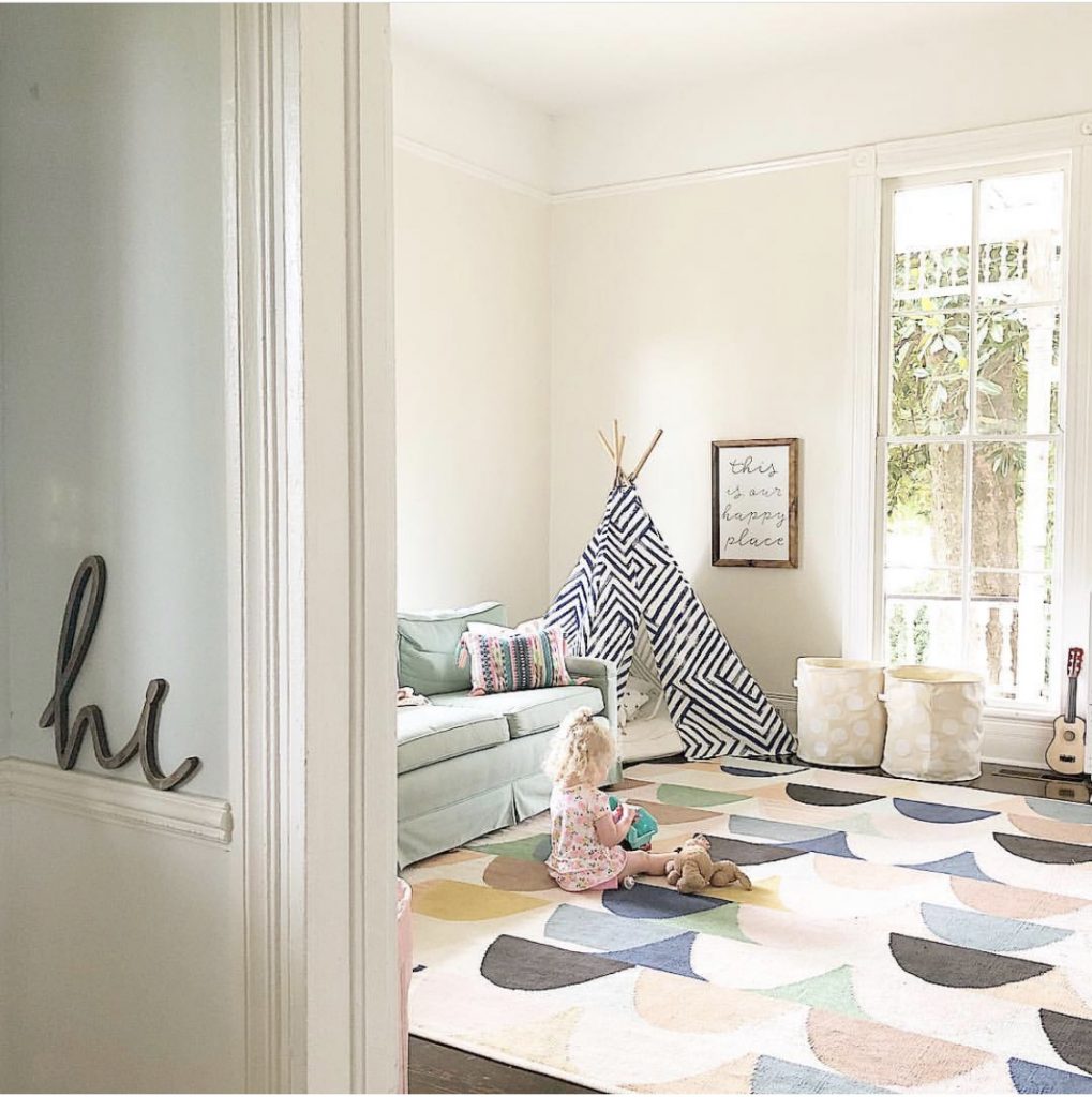
Katherine said they went through an adjustment period, having a home that wasn’t an open concept floor plan, as is so popular today. “It took us a little while to get used to it, but now, we really like it,” Katherine said, “it’s nice and it feels like everything has its place.”
As she guided us through their home, you could see so much of their family personality and creativity shining through.
For example, she painted the spindles on one of their staircases with numbers, and for Christmas they moved a star along the spindles as a countdown; they now use this for birthdays and other special occasions too.
She also had a friend stencil this fun, whimsical idea on another staircase. You can’t see it unless you’re right under it, which is a fun way to add some more character and personality.
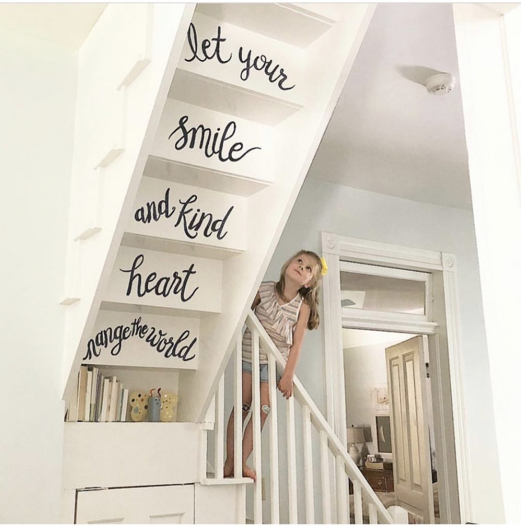
“I feel like if you have a weird house, you might as well lean into it,” Katherine says.
Their home has 10 fireplaces, and very tall ceilings, so Katherine has also been very creative in thinking of budget friendly ways to fill the wall space. Small things don’t always look right, and large things can be expensive.
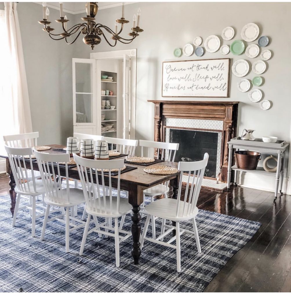
One of her favorites is this plate wall, where she’ll often swap plates depending on the season or holiday. During the tour, a few Easter bunnies made an appearance!
Katherine said it was inexpensive to hang the plate hangers, and then whatever seasonal china or regular plates she wants to put there, she can.
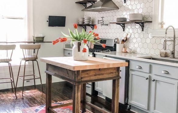
She saved the kitchen for last. One of the trickiest things about this space was that it had 7 different openings — counting doors, windows, and fireplaces — so they really had to budget where to store their things.
But, because it’s not open concept, Katherine loves that she can hide a mess in the kitchen when they have guests in the dining room, and “nobody’s up in [her] business.”
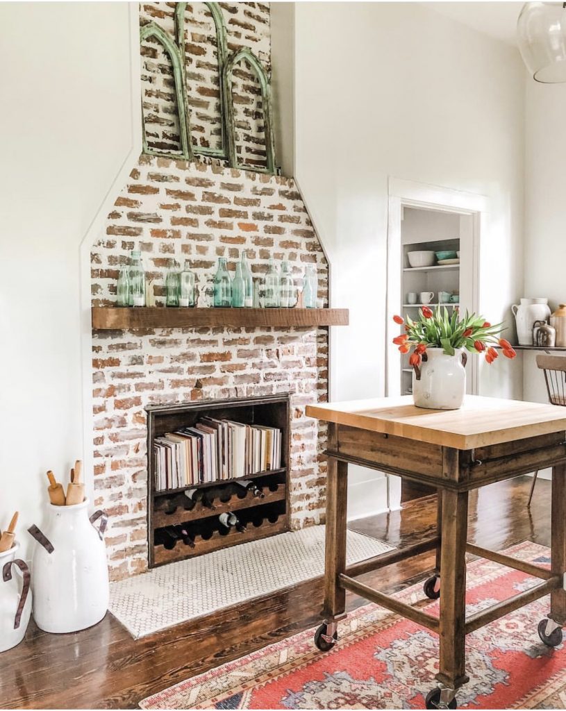
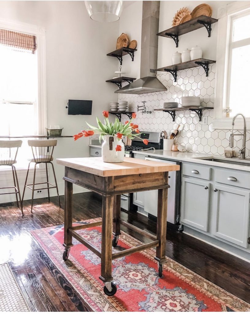
They renovated the kitchen before moving in, pulling up tile and linoleum to find the hardwoods — and much of the rest of the house too. But, Katherine said, you don’t always need to do a fancy renovation to make an impact. Sometimes, all you need is paint and a little bit of creativity.

Find Katherine on Instagram: @design_central_project
If you like this, you might also like:
